 EveryGen AI
GPT-Image-2 in Practice: Build a Full Brand Kit for a Small Business in One Day (Brand Board / Logo Mark / Social Assets)
Develop a cohesive stationery brand kit with a logo system, color targets, typography, packaging, and social concepts.
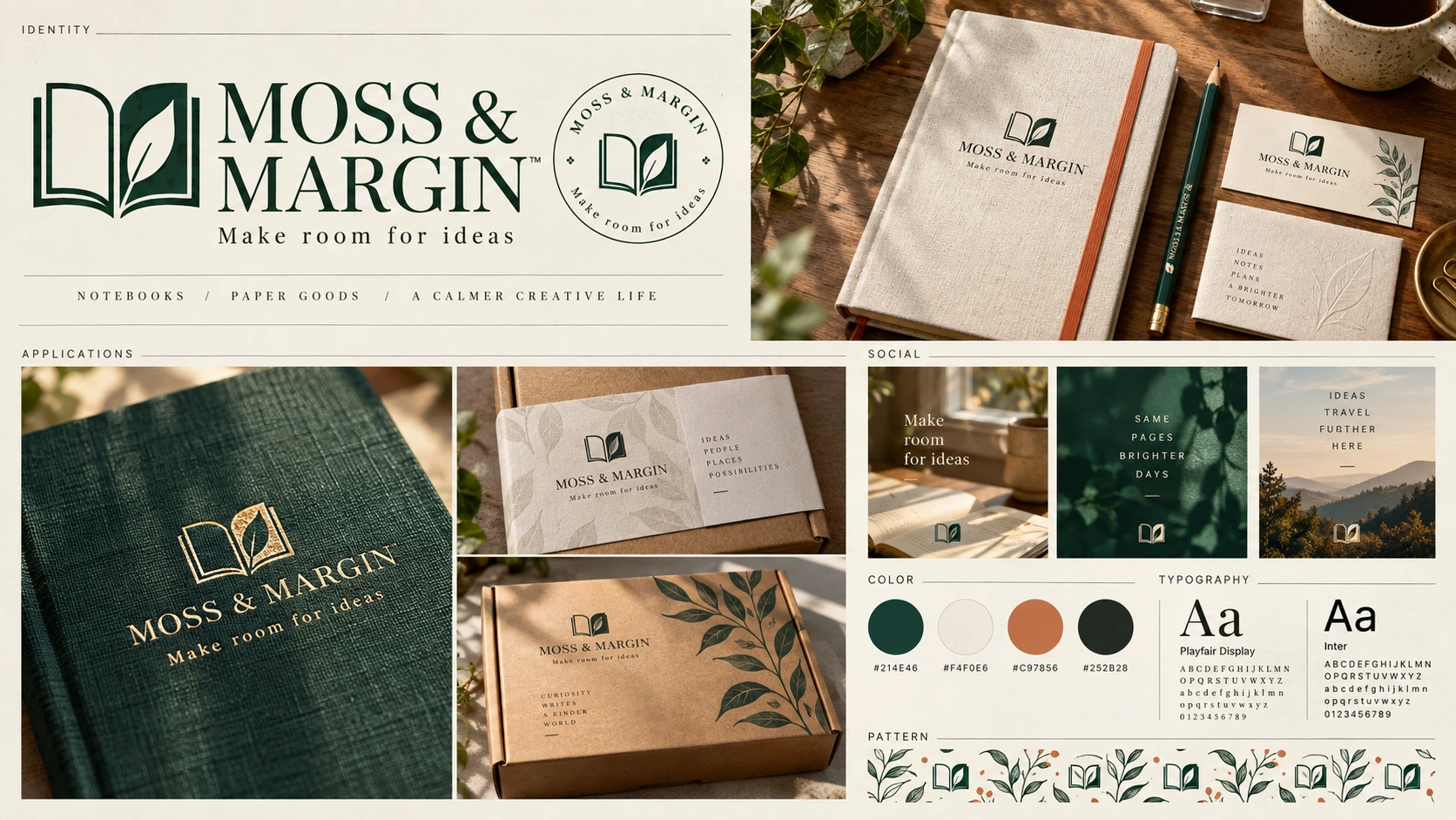
A brand board can show a promising direction without giving you the files needed to use it consistently. The symbol might work, but the lettering may still need rebuilding, the colors may differ from their labels, and the notebook mockup may contain a slightly different logo.
This walkthrough develops a coherent identity for MOSS & MARGIN, a fictional stationery brand: a logo system, exact name and tagline, four target colors, a typography record, notebook and packaging applications, and social assets. Treat “one day” as a time-box for developing and reviewing a concept kit, not a guarantee of production readiness.
The two illustrations are Codex-generated teaching concepts, not EveryGen AI test outputs or photographs of real products. The fictional name and design are not presented as a registered, cleared, or exclusive brand.
1. Write the brief and keep the copy outside the image
Use this one-sentence brief:
MOSS & MARGIN makes thoughtfully simple stationery for everyday writing, with a quiet visual identity built around an open notebook whose right-hand page forms a single leaf.
Keep the name and tagline in a separate text document:
MOSS & MARGIN
Make room for ideas
The name uses an ampersand and uppercase letters. The tagline uses sentence case without a final period. These strings remain the source of truth even when a generated image renders something different.
Define four color targets before making the board:
| Role | Color direction | Target HEX |
|---|---|---|
| Primary mark | Deep green | #214E46 |
| Main background | Ivory | #F4F0E6 |
| Accent | Terracotta | #C97856 |
| Supporting text | Charcoal | #252B28 |
These are chosen targets, not measured results. Do not change the record merely because a generated swatch looks close.
Keep the initial scope small. You are choosing one identity direction, not requesting a grid of unrelated logos, a font family, packaging files, and a website in the same image.
2. Generate a concept board with a specific layout
Open EveryGen AI to develop a stationery-brand mark.
The interface checked on September 30, 2026, starts in Text to Image with GPT Image 2, a 1:1 aspect ratio, 1K, JPEG, and x1. For this landscape concept board, deliberately change the ratio to 3:2. Keep 1K, JPEG, and x1 for the initial candidate.
Paste the complete prompt below:
Create one 3:2 landscape brand-guidelines concept for MOSS & MARGIN,
a fictional stationery brand. Exact tagline: Make room for ideas

Design an original deep-green open-notebook symbol whose right page forms
one leaf. Keep its silhouette, central fold, and lettering readable.

Use a carefully aligned ivory editorial grid with:
- A large primary symbol and wordmark.
- Icon-only and reversed ivory-on-green versions of the SAME mark.
- A clear-space construction example.
- Four target color swatches, labeled exactly:
  #214E46, #F4F0E6, #C97856, #252B28.
- Two typography directions labeled Serif heading and Sans body.
- Small good/bad usage comparisons for proportions, contrast, and clear space.

Keep the name, tagline, and swatch labels legible. Use restrained paper texture
and fine rules. Do not invent registered status, a font license, measured
color accuracy, or production-ready vector files.
The prompt requests particular colors and lettering; it does not establish that the exported pixels or text will match them. Save the candidate and the prompt used, then inspect the downloaded file.
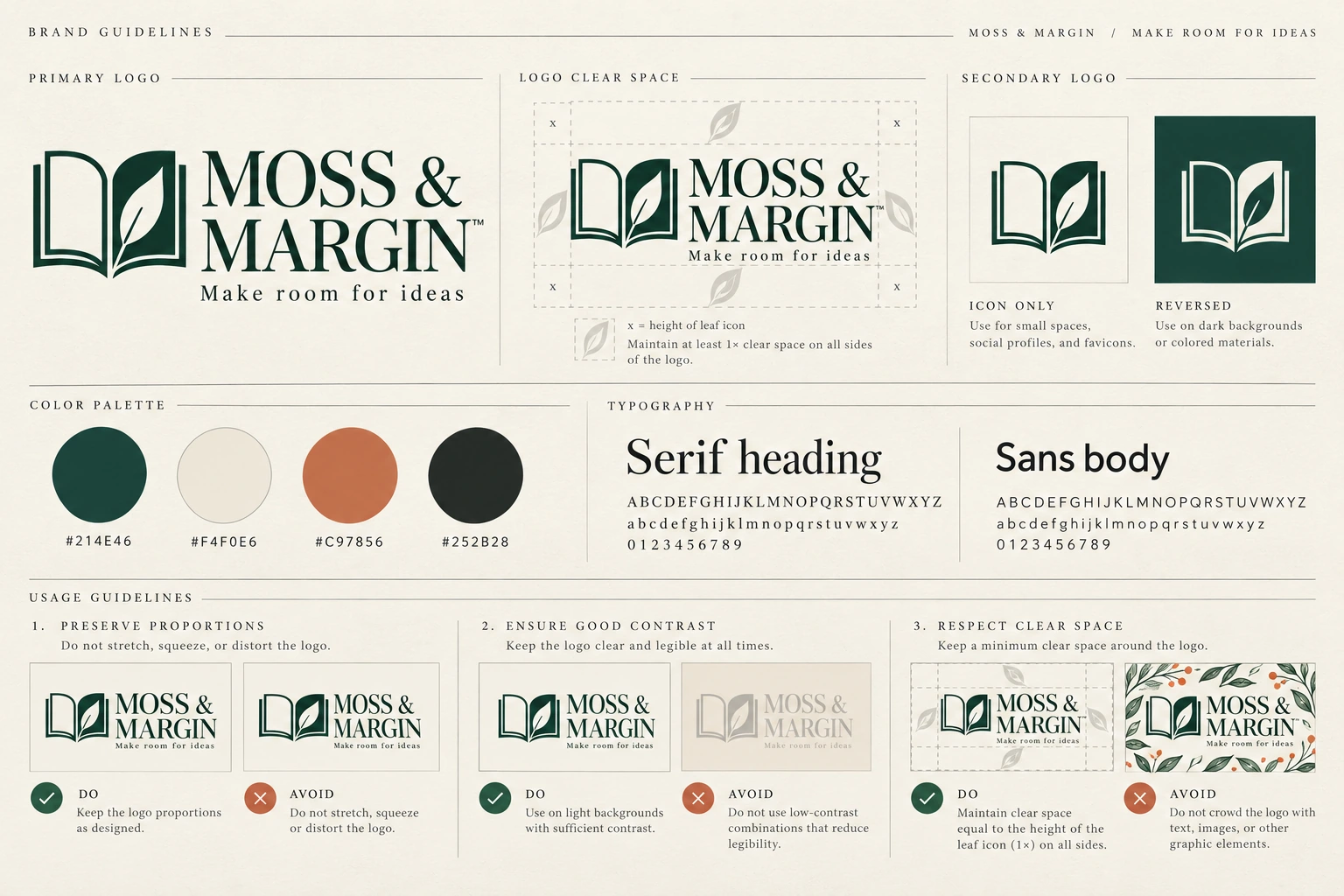
Codex-generated teaching concept, not a EveryGen AI test output or a registered brand identity. The HEX labels are agreed targets; the lightly textured swatch pixels are not verified measurements of those values.
The supplied illustration is a teaching asset. Its file format does not establish an export option in the generation interface. Generated trademark symbols or font names are not proof of registration or a font license; remove unsupported marks and choose actual fonts independently.
3. Check the symbol and spelling before accepting the direction
Start with the mark, not the presentation.
Does it read as an open notebook? Is there exactly one leaf, formed by the right-hand page? Is the central fold visible, or has it become an ambiguous cluster of lines?
Make a temporary crop of the symbol for inspection. View it at the size of its intended small use, such as a compact website mark or a small cover imprint. Check whether the notebook-and-leaf construction remains understandable. This crop is a review aid, not a finished logo asset.
If the leaf or center fold disappears at the intended size, simplify the construction before making more applications. A larger image does not resolve an overcomplicated symbol.
Next, compare the text character by character with the written copy. Check the ampersand, the spelling of MARGIN, and the exact tagline Make room for ideas Do not accept near-correct lettering because the board looks polished.
Save a candidate only when it is suitable to continue exploring. Label it accepted concept reference, not final brand master. That distinction matters when you begin producing reusable assets.
4. Turn the color targets into a usable specification
For a screen-oriented specification, record the four targets as sRGB colors. Keep that color-space information with the numeric values.
In an external design application, create four solid swatches by entering the values from the table. Keep these controlled swatches separate from the generated board.
Then inspect the actual downloaded image with a color picker in your external design application. Choose sampling positions and record their hexadecimal values. This is a separate inspection step, not a EveryGen AI control.
Sample inside each swatch, away from labels, outlines, and edges. Check more than one point when a swatch contains texture. Record the file, the working color profile, the target, and the actual readings. Do not invent a measured value or select one convenient pixel to make a textured area appear uniform.
If a swatch differs from its target, rebuild the specification swatch with the intended numeric fill. Do not rewrite the target label to make the discrepancy disappear.
Keep the roles separate:
The concept image shows a color direction.
The color record defines the values to reuse.
The production artwork needs those values applied and checked in the appropriate workflow.
For printing, ask the supplier how to prepare and proof the colors for the intended material. Do not treat a HEX label—or a generated image of an ivory notebook—as a physical color proof.
5. Choose real fonts and record what you selected
Treat the generated lettering as a visual suggestion, not evidence that a particular font was used or supplied.
For this kit, start by comparing a few real, available typefaces in your design application. Type both exact strings yourself. Inspect the uppercase name, the ampersand, the tagline at its intended size, and the spacing between letters.
Choose the typeface deliberately rather than trying to assign an invented font name to the pixels. One family with a suitable heavier weight for headings and a regular weight for supporting copy may be enough.
Keep a short record:
| Field | What to record |
|---|---|
| Typeface | Actual family name and version |
| Roles | Brand-name treatment, headings, tagline, and body copy |
| Weights | The exact weights selected |
| Source | Foundry or authorized provider URL |
| License review | License URL, review date, intended uses, and collaborator requirements |
| Layout decisions | Any deliberate tracking, spacing, or size rules |
Check the selected provider’s terms for the intended uses and for any sharing of the font software. Record how collaborators should obtain the font rather than assuming a copy can be included in the kit.
If the font has not been selected and checked, mark the typography record as pending. Do not call the generated lettering an installable font.
6. Use the accepted concept across notebook, packaging, and social applications
The second generation is a notebook application, not another attempt to invent the brand.
Switch to Image to Image on the main page and provide the accepted concept board as the reference. You can also reuse the approved visual reference through the separate image-to-image entry. Here, “approved” means selected for this visual exploration, not legally cleared or production-ready.
Confirm 3:2, 1K, JPEG, and x1 again rather than assuming every setting carries over when changing modes.
Use this application prompt:
Use the uploaded MOSS & MARGIN concept board as the visual identity reference.

Create one 3:2 landscape application plate with a large ivory hardcover notebook, a matching card and kraft package, and three smaller details for notebook, packaging, and social use.
Make the notebook the primary subject on a warm wood surface.
Make the front cover easy to inspect, with no strong perspective distortion.

Place a rust-colored elastic closure vertically near the viewer's right edge of the notebook.

On the front cover, use the reference's deep-green open-notebook symbol:
- The right-hand page forms one leaf.
- Preserve the central fold and the relationship between the two pages.
- Do not add leaves or redesign the symbol.

Below the symbol, place the exact name:
MOSS & MARGIN

Below the name, place the exact tagline:
Make room for ideas

Reuse the same symbol, name, and tagline consistently on each application.
Keep the three elements readable and away from the elastic closure.
Follow the reference's lettering direction without inventing extra words.

Retain the target palette:
Deep green #214E46
Ivory #F4F0E6
Terracotta #C97856
Charcoal #252B28

Use deep-green artwork on the ivory cover and the terracotta direction for the elastic.
Do not add elements merely to display every palette color.

Use restrained, plausible product lighting.
Do not include the concept board, color swatches, HEX labels, extra notebooks, badges, registration symbols, or unrelated promotional text. Use restrained environmental styling and rich paper, linen, and wood textures.

This is a visual application concept, not a manufacturing specification or a photograph of an existing product.
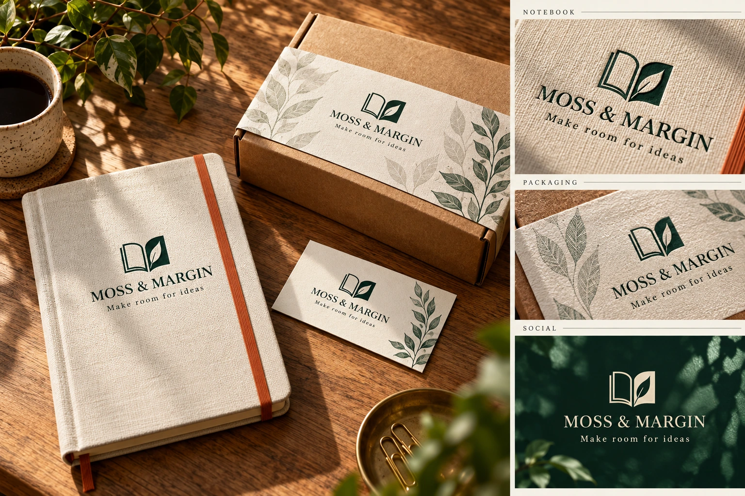
Codex-generated teaching application, not a EveryGen AI test output or a real product photograph. It continues the notebook-and-leaf construction, but does not establish identical geometry, measured color accuracy, or final brand approval.
Compare your application candidate with its accepted reference. Look at the leaf count, center fold, proportions of the notebook pages, and placement of the name and tagline. Recheck every word.
Judge the application for direction: does the symbol have enough space, can the tagline be read, and does the elastic interfere with the artwork? Do not use the rendered cover as the source from which to extract the final logo or its colors.
For actual notebook printing, place the fixed, checked logo asset and properly typeset text into a design document using the supplier’s layout requirements. The generated application tests the idea; it does not replace that file.
7. Match each failure to the right correction
Keep the accepted reference separate from new candidates. A request to preserve the mark is not a geometry lock, so every revision needs another comparison.
| Problem | Next action |
|---|---|
| The application adds a second leaf or changes the notebook construction. | Return to the accepted board and request only the original single-leaf construction. If it continues to drift, place the approved artwork onto the application in an external design tool. |
| The name or tagline is misspelled. | Request a focused text correction or replace the lettering with real text externally. Recheck the symbol after any generated revision. |
| The HEX label is correct but the swatch pixels differ. | Rebuild the specification swatch with the numeric target. Do not keep regenerating a whole board to obtain a controlled flat fill. |
| The symbol becomes unclear at small size. | Simplify its construction and review it again at the intended size before extending the identity. |
| Changing the elastic moves or distorts the cover artwork. | Return to the last acceptable application. Revise only the elastic, or make the adjustment externally when exact placement matters. |
| A collaborator asks for editable lettering or vector artwork. | Move to typography and path reconstruction. Do not rename the JPEG or describe it as a layered brand file. |
For a single-symbol correction, a focused request could be:
Use the accepted reference’s open-notebook symbol. Keep exactly one leaf formed by the right-hand page. Remove the additional leaf without changing the name, tagline, notebook cover, or elastic placement.
That defines the requested change, not a guarantee that everything else will remain untouched.
8. Rebuild the mark before treating it as a master asset
A flat logo on a plain background is still a picture when its construction exists only as pixels. Adobe’s explanation of raster and vector artwork distinguishes pixel-based images from artwork defined by shapes, points, lines, and curves.
Putting a JPEG inside an SVG does not turn the mark into editable paths. Check the actual objects and paths in your design application, not just the filename.
In a vector design application, rebuild or trace the notebook-and-leaf symbol, then inspect and refine its paths. Remove accidental fragments, review the center fold and page gaps, and check the result at small and large sizes. Recreate the name and tagline using the selected typography.
Keep an editable source and export the formats required for the intended use. Automatic tracing can be a starting operation; it is not the final inspection.
For repeatable applications, reuse this checked master instead of generating a new version of the logo for every product.
9. Package the smallest kit someone else can use
Once the assets and decisions are ready, organize the chosen identity in a brand kit. Adobe’s workflow separates uploaded logos, numeric colors, fonts, and templates—a useful organization model, rather than treating the concept board as all of those resources at once.
Use a handoff like this:
| Deliverable | Required contents |
|---|---|
| Brief and exact copy | The one-sentence brief, MOSS & MARGIN, and Make room for ideas |
| Concept references | The accepted board and notebook application, clearly labeled as concepts |
| Logo assets | Checked editable master and appropriate exports; otherwise explicitly marked “reconstruction pending” |
| Color specification | Four targets, color-space information, intended roles, and any recorded verification results |
| Typography record | Real family, weights, roles, source, license review, and editing requirements |
| Application document | A manually laid-out cover using the checked assets when preparing for production |
| Usage note | Chosen logo arrangement, spacing guidance, tested sizes, version, and unresolved items |
Do not include font software merely because it appears in the design; follow the relevant license and provide acquisition information where appropriate. Keep abandoned candidates away from the current assets.
Before commercial use, arrange the appropriate name and mark checks for the intended markets. This exercise does not establish availability, registrability, or exclusivity.
The minimal kit is useful when another person can reproduce the chosen identity without guessing the colors, inventing a font, or redrawing the symbol from a product image. The concept board starts that process. The checked assets and written decisions complete the handoff.
Extend the accepted identity into the complete concept kit
Make each application from the accepted identity reference rather than requesting a new logo each time. The teaching plate shows a notebook, card, paper wrap, kraft package, and social tile. Compare the mark's proportions and lettering across all of them; a realistic embossing effect can conceal a changed symbol.
| Asset | Brief | Review requirement |
|---|---|---|
| Brand board | Primary, secondary, and reversed marks; colors; typography | One coherent identity and exact copy |
| Packaging | Paper sleeve and kraft mailer using the accepted mark | Same symbol, safe margins, readable lettering |
| Social tile | One message, one visual, consistent palette | Readable at feed size; no unsupported claims |
| Working master | Editable mark, real text, entered color values | Rebuilt and checked outside the generated image |
A practical day can be divided into briefing, concept exploration, application studies, and review. If spelling, readability, or consistency still fails at the end, keep the result labeled as a draft. Generated mockups do not supply a print dieline, a cleared trademark, licensed fonts, or a reusable vector logo by themselves.