 EveryGen AI
GPT-Image-2 in Practice: Make a Marketing Poster from One Prompt (Promo Poster + Social Cover + Video Thumbnail, with the Trick for Getting Text Right)
Create an event poster with accurate copy, a readable hierarchy, and a clear call to action.
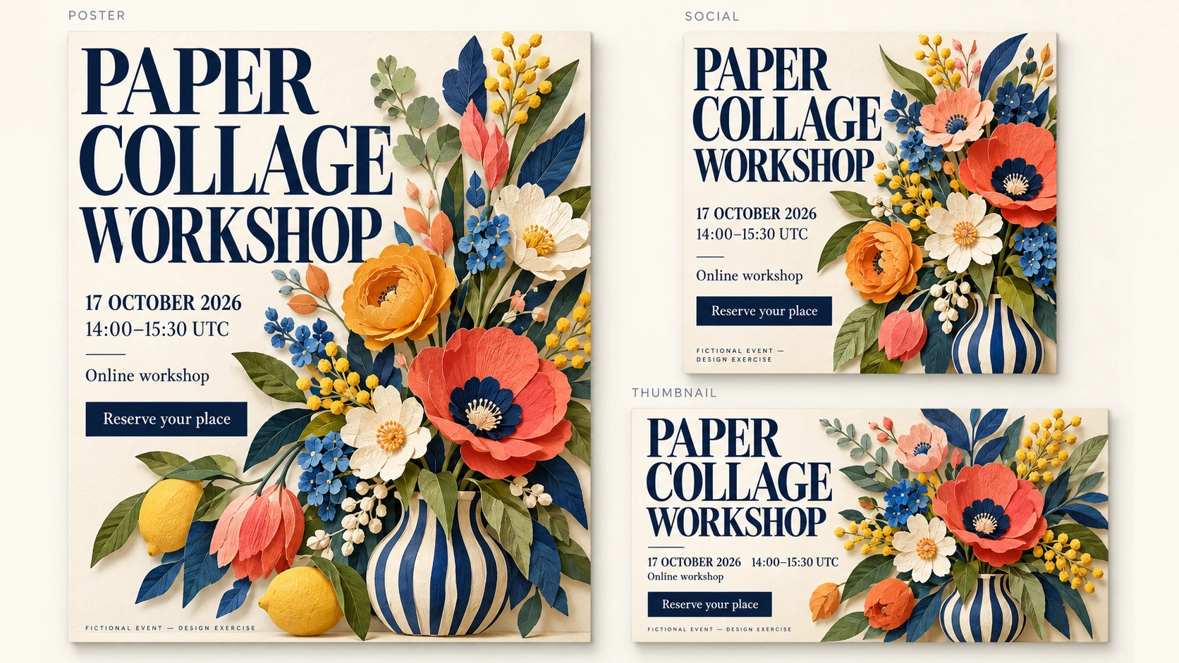
An event poster needs to answer a few questions clearly: what is happening, when it happens, how it takes place, and what the reader should do next. A polished layout cannot compensate for an incorrect date or an unreadable time.
This walkthrough creates one poster for PAPER COLLAGE WORKSHOP, a fictional design exercise with no actual event or registration service. You will prepare the exact copy, establish a reading order, generate a candidate in EveryGen AI, and check the information before refining its appearance.
Preview the intended result
The concept uses a cream paper background, dark-blue lettering, an intricate cut-paper botanical bouquet, and one dark-blue call-to-action block. The title leads; the date, time, and event format stay together.

Codex-generated teaching illustration, not a EveryGen AI output. The poster is a static concept, and its call to action is not a working registration button.
The serif-style headline describes a visual direction. It does not identify a particular font family or establish that an installable font has been supplied.
1. Keep an approved copy record
Store the following six text blocks in a separate document before creating the image. Use that record—not the generated lettering—as the source of truth.
| Purpose | Exact text |
|---|---|
| Title | PAPER COLLAGE WORKSHOP |
| Date | 17 OCTOBER 2026 |
| Time | 14:00–15:30 UTC |
| Event format | Online workshop |
| Call to action | Reserve your place |
| Exercise notice | FICTIONAL EVENT — DESIGN EXERCISE |
Preserve capitalization and punctuation, including the dash between the times and the dash in the exercise notice. Keep UTC attached to the time so the intended time zone remains explicit.
Do not add prices, attendance limits, discounts, speakers, organizations, addresses, or registration links. None belongs to this brief.
2. Arrange four main areas
Before choosing decorative details, give the information a clear structure:
Title → main visual → event details → call to action
Place the exercise notice beneath these areas, large enough to read.
Adobe’s guide to poster hierarchy recommends establishing the poster’s goal and visual hierarchy before refining the design. Here, the goal is to communicate one activity and one intended action—not to give every element equal emphasis.
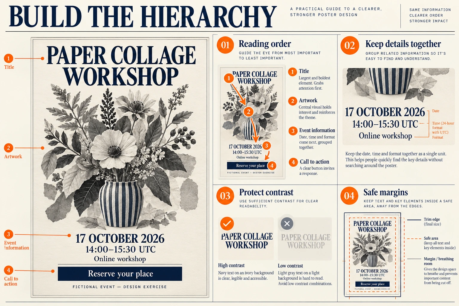
Codex-generated hierarchy study. The callouts explain reading order, contrast, and safe margins; they are not an editable template or a EveryGen AI output.
Keep the date, time, and Online workshop together as one information group. Separate the CTA from that group without making the reader search for it.
The hierarchy plate explains the structure. You do not need to generate or upload it before following the text-to-image workflow.
3. Copy a prompt that specifies the complete poster
Use the prompt below to request the colored poster directly.
Create one flat, static event-poster concept on a 2:3 portrait canvas.

This is a fictional design exercise, not a real event announcement.

Use exactly these six text blocks:

PAPER COLLAGE WORKSHOP
17 OCTOBER 2026
14:00–15:30 UTC
Online workshop
Reserve your place
FICTIONAL EVENT — DESIGN EXERCISE

Layout:
Arrange four main areas vertically, with clear separation and generous margins.

1. Title area
Place PAPER COLLAGE WORKSHOP at the top.
Make it the largest text on the poster.
Use readable serif-style lettering in deep navy blue.
Line breaks are allowed, but preserve all three words exactly.

2. Main visual
Create an intricate cut-paper botanical bouquet in a striped vase.
Use layered cobalt, coral, ochre, and sage petals and leaves with visible paper fibers and folded shadows.
Keep the artwork separate from the lettering.
Do not include people, hands, scissors, brands, or additional written labels.

3. Event-information area
Group these three lines together below the main visual, in this order:
17 OCTOBER 2026
14:00–15:30 UTC
Online workshop

Use clear dark-blue lettering.
Keep the date, time, and event format large enough to read without competing with the title.

4. Call-to-action area
Place one solid deep-navy rectangular block below the event information.
Center the exact words Reserve your place inside it in contrasting light lettering.
Keep the full label visible, with comfortable internal spacing.

Footer:
Below the CTA, place this exact notice:
FICTIONAL EVENT — DESIGN EXERCISE

Make the notice clearly readable. Do not hide it in tiny text or crop it.

Visual treatment:
Use a cream paper background, deep-navy text, and restrained colorful collage shapes.
Keep the text areas visually clean.
Do not run paper shapes, heavy texture, or shadows across the words.
Keep all content inside the canvas with visible outer margins.

Text rules:
Render each of the six specified text blocks exactly once.
Preserve spelling, capitalization, and punctuation.
Do not print the numbered instructions or section names.
Do not add any other text.

Exclusions:
No prices, discounts, attendance claims, speaker names, organization names, logos, addresses, registration URLs, QR codes, or additional calls to action.
No phone frame, wall mockup, perspective view, alternate poster, or split-screen layout.
These instructions define the candidate you will evaluate. They do not guarantee exact spelling, placement, or contrast.
4. Generate a candidate with the correct settings
Open EveryGen AI to compose a poster around one event.
The checked interface defaults to Text to Image, GPT Image 2, 1:1, 1K, JPEG, and x1. Open the settings and deliberately change the aspect ratio from 1:1 to 2:3.
| Setting | Choice for this example |
|---|---|
| Mode | Text to Image |
| Model | GPT Image 2 |
| Aspect ratio | 2:3 portrait |
| Resolution preset | 1K |
| Output format | JPEG |
| Output count | x1 |
Paste the complete prompt, confirm the settings, and submit when ready. Save the candidate you intend to review, together with its prompt and settings.
The illustrations in this article are separate teaching assets. They do not indicate a PNG export option in the JPEG workflow described here.
5. Check the information before judging the design
Open the downloaded file and compare it with the copy record.
Read all six text blocks
Check the title word by word. Then inspect the date, start and end times, UTC, event format, CTA, and exercise notice.
Look for substitutions that seem plausible at a glance: a different day, a missing time-zone label, or a rewritten CTA. Check that no unapproved information has appeared elsewhere.
A candidate with an incorrect date is not ready, regardless of how good the collage looks.
Check the reading order
Look at the poster briefly, then identify what draws attention first.
The title should establish the activity. The visual should support it without obscuring the information. The date, time, and format should read as a group, followed by one clear CTA.
If the collage dominates while the time disappears into small lettering, rebalance the layout rather than adding more decorative emphasis.
Inspect readability at the intended size
View the image at 100% zoom, then place it at the width it will occupy on your page, slide, or post.
Check that the event details and footer remain readable at that size. Look for weak contrast, paper texture crossing letters, crowded lines, and insufficient space inside the CTA block.
Dark lettering on a light background is a useful starting direction, not automatic proof of readability. Inspect the actual result.
Higher resolution does not automatically correct a misspelled title, an incorrect date, or an information block that has been given too little space.
6. Make one focused correction
Keep the original candidate before editing. Switch to Image to Image on the main page and upload your saved file. The separate editing entry also lets you refine the poster from a saved version.
Confirm the intended ratio and output settings again.
For a candidate with an incorrect date, use a focused request:
Edit the uploaded PAPER COLLAGE WORKSHOP poster.

Set the date line to exactly:
17 OCTOBER 2026

Remove the incorrect date rather than adding a second date.

Preserve all other text, the collage artwork, the information grouping, the CTA, the readable fictional-event notice, and the original 2:3 layout.

Do not add new information, links, or a QR code.
This describes the intended scope. It does not lock the other regions. After the revision, recheck all six text blocks and the entire layout.
Use the fallback that matches the actual problem:
| Problem | Next action |
|---|---|
| A date, time, or phrase is wrong. | Request replacement with the exact approved text. If it remains unreliable, replace the lettering externally. |
| An invented offer or extra CTA appears. | Remove it and return to the six-block brief. Check that the correction has not removed required information. |
| Event details are too small. | Give the information group more space and reduce the main visual. Recheck at the intended display size. |
| Texture or artwork interferes with the text. | Request a cleaner text area or rebuild that area externally with a controlled background. |
| One correction changes other approved details. | Reject the revision and return to the saved baseline instead of carrying the new errors forward. |
Use real text when image revision is not precise enough
For persistent lettering problems, open the candidate in an external design application. Remove or cover the incorrect text cleanly, then add actual text fields using the approved copy.
Choose a real typeface available in that application. Do not assume that the generated serif-style heading identifies a specific font.
If the old lettering cannot be removed without damaging the design, rebuild the text areas—or the complete poster—using the candidate as a visual reference. Keep the wording editable in that external source file.
This is a separate repair workflow, not a EveryGen AI text-layer feature.
7. Export, share, and distinguish the CTA from its destination
Reopen the exact JPEG you plan to share. Confirm its dimensions, crop, spelling, and readability after any final editing or resizing. Keep an untouched export and retain any editable source created during external repairs.
For this exercise, leave FICTIONAL EVENT — DESIGN EXERCISE visible and do not attach a registration destination.
The words Reserve your place are part of the image. They do not create a clickable button or a booking service.
For a real event, the organizer would need a separate, working registration destination. Its title, date, time zone, and event format should agree with the poster. Add the actual link through the webpage or platform where the poster is shared.
When a real destination exists and a QR code is appropriate, create a QR code from a real destination. Adobe’s workflow uses a supplied URL and recommends testing the code with a phone. Test it again in the final exported layout rather than asking an image generator to invent a QR-like pattern.
The poster is ready for visual review when its six approved text blocks are correct, the activity and timing are easy to find, the CTA is distinct, and the exercise notice remains readable at the intended size.
Adapt the campaign to a social cover or video thumbnail
Keep the approved event copy in one record while changing the composition for each format. For a square social cover, keep the title and bouquet prominent and group the date, time, and format underneath. For a wide video thumbnail, place a short readable title on one side and the bouquet on the other. Reflow the design instead of cutting a portrait poster into a new ratio.
The article cover demonstrates these three arrangements. They are concept formats, not claims about a platform's current upload requirements. Preview each exported file at its intended display size; move secondary details into the accompanying post when they become too small to read. For this fictional exercise, retain the fictional-event notice.