 EveryGen AI
GPT-Image-2 in Practice: Generate App and Web UI Mockups from One Prompt (Mobile Screen / SaaS Dashboard / Landing Page)
Create a static app UI concept with GPT Image 2, then check the exact copy, layout, hierarchy, and component counts.
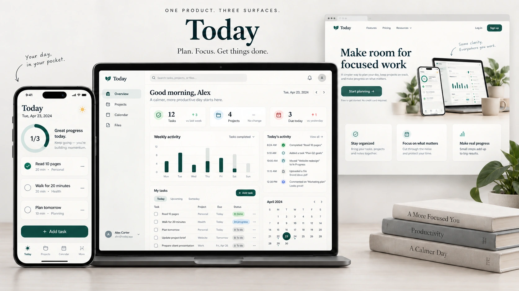
A useful UI mockup makes the product's information, hierarchy, and states clear. GPT Image 2 can help explore the visual direction of a mobile screen, a SaaS dashboard, or a landing page. Each output is a static concept image, not working software or an editable component library.
This walkthrough develops Today, a fictional personal task app. Start with its mobile screen, then adapt the same content and visual rules to desktop and marketing layouts. The illustrations are Codex-generated teaching examples, not EveryGen AI test outputs.
1. Define the content and state
The mobile example shows three incomplete tasks. Its progress indicator must therefore read 0 of 3 complete, and all three task checkboxes must be empty.
| Element | Copy or state |
|---|---|
| Title | Today |
| Date | Tuesday, 29 September |
| Progress | 0 of 3 complete and 0% |
| Supporting line | A little focus goes a long way. |
| Task 1 | Read 10 pages — Personal · 20 min |
| Task 2 | Walk for 20 minutes — Health · 20 min |
| Task 3 | Plan tomorrow — Planning · 10 min |
| Primary action | Add task |
| Navigation | Today / Projects / Calendar / Profile |
These are example contents, not live account data. The date strip highlights Tuesday 29; the progress summary is derived from the task state rather than chosen as decoration.
2. Plan the hierarchy and reusable components
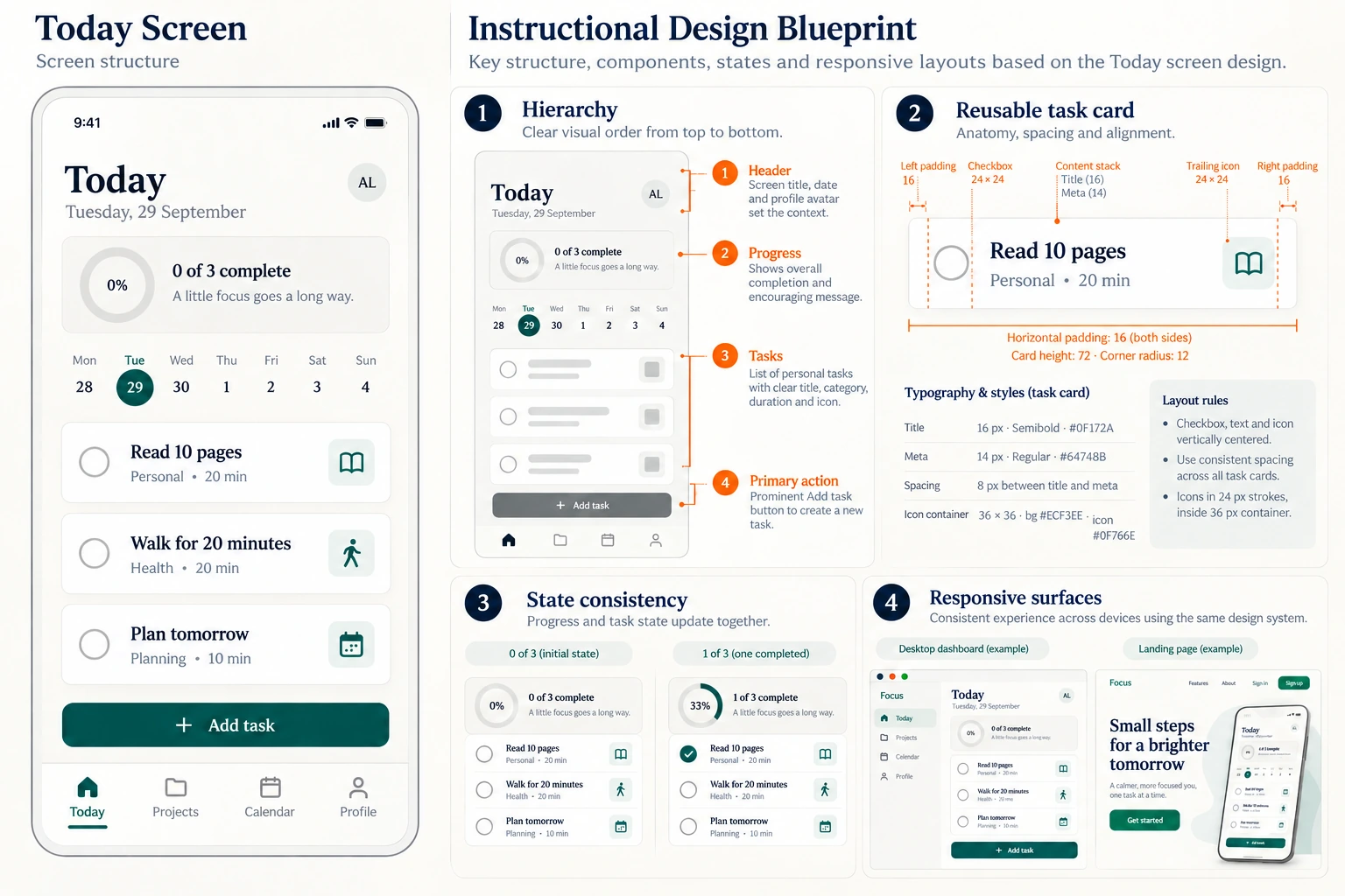
Static teaching plate. Layout measurements are illustrative design suggestions, not dimensions extracted from an implemented app.
Read the screen from header to progress, date strip, task list, primary action, and navigation. Keep the task cards consistent: checkbox on the left, title and metadata in the middle, category icon on the right.
Distinguish the prominent Add task action from the quieter navigation. A bottom navigation item changes sections; it should not visually compete with the action that creates a task.
3. Generate the mobile screen from one complete prompt
Open GPT Image 2 in EveryGen AI, choose Text to Image, and select a 9:16 portrait ratio. Start at 1K to review composition before increasing resolution. Check the actual available output format in the interface; the teaching images here do not establish an export option.
Create one complete static mobile UI concept for a fictional task app called Today.
Use a flat 9:16 portrait canvas with no device frame or surrounding scene.

Visual direction:
Cream background, charcoal text, white task cards, deep teal accents,
subtle borders and shadows, clear readable typography, generous safe margins.

Header:
Today
Tuesday, 29 September
A small avatar circle with AL.

Progress card:
0 of 3 complete
0%
A little focus goes a long way.
Show an empty pale progress ring, with no completed green segment.

Add a seven-day strip: Mon 28, Tue 29, Wed 30, Thu 1, Fri 2, Sat 3, Sun 4.
Highlight Tue 29.

Exactly three task cards, all with EMPTY circular checkboxes:
Read 10 pages — Personal · 20 min — book icon
Walk for 20 minutes — Health · 20 min — walking icon
Plan tomorrow — Planning · 10 min — calendar icon

Place one prominent deep-teal Add task button beneath the cards.
Bottom navigation: Today, Projects, Calendar, Profile. Select Today.

Align repeated components, preserve every word, and keep all content visible.
Do not invent extra tasks, checked states, or a working interactive interface.
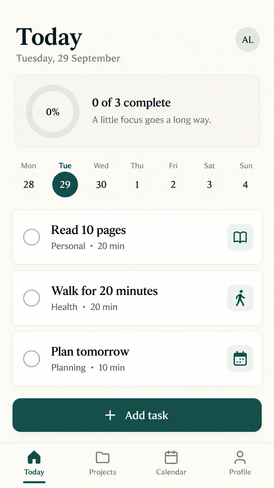
Codex-generated concept. Buttons, icons, and navigation are pixels in an image; they do not perform actions.
4. Adapt the brief to a SaaS dashboard
Use a landscape ratio and give the desktop version a clear information architecture. Reuse the product name, palette, task wording, and status vocabulary. Replace the mobile layout instructions with:
Create a static landscape SaaS dashboard for Today.
Use a left sidebar: Overview, Projects, Calendar, Files.
Place a greeting and summary cards above the main workspace.
Use a task table with Task, Project, Status, and Due columns.
Include a weekly activity chart and a compact calendar in a secondary column.
Use the same cream, charcoal, white, and deep-teal visual system.
Label any invented analytics as example data.
Keep table headings and status labels readable; do not add a mobile device frame.
Specify the actual sample rows and chart values before generating a detailed dashboard. Check that displayed totals agree with those values. A convincing chart is not evidence that its data are correct.
5. Adapt the brief to a landing page
The landing page explains the benefit before asking someone to start. It does not need every dashboard control.
Create a static desktop landing-page concept for the fictional Today app.
Headline: Make room for focused work
Primary CTA: Start planning
Show a product preview and three concise benefit cards:
Stay organized / Focus on what matters / Make real progress.
Use the same deep-teal accent, warm ivory surfaces, and restrained typography.
Keep the headline and CTA readable at ordinary browser size.
Do not invent customer logos, testimonials, prices, or performance statistics.
The article's cover shows how these three surfaces can share a visual language. Generate individual screens separately when you need to inspect small text; a presentation containing several devices gives each screen fewer pixels.
6. Review words, state, and geometry separately
First compare every visible label with the approved copy. Then count cards, checkboxes, navigation items, and primary actions. Finally inspect alignment, contrast, spacing, and safe margins.
A 1 of 3 state requires exactly one completed task. A 0 of 3 state requires none. Do not approve a progress ring that contradicts its task list merely because the screen looks polished.
For a correction, upload the saved candidate in Image to Image and describe one observable change, for example:
Correct only the second task label to Walk for 20 minutes.
Preserve the other copy, three empty checkboxes, zero progress,
layout, colors, navigation, and Add task button.
Compare the entire revision with the previous version: an instruction to preserve other regions is not a guarantee that they remain identical.
7. Turn the selected concept into a real design
Save the approved image with its copy record, intended states, and unresolved issues. Rebuild the layout with editable text and components in a design tool or codebase. Validate keyboard navigation, responsive behavior, contrast, and real interactions in that implementation.
A generated mockup is useful for discussing direction. It does not establish accessibility compliance, supply font licenses, or replace testing a working interface.